This post is about data plotting or visualization methods for data analysis and each technique has been explained with an example using iris dataset. You can also find some important posts in this blog like machine learning modelling process, list of regression techniques, confusion matrix, root-mean-squared-error. If you are interested in reading research papers then kindly refer post on classifier and regression models. There you can find code of 77 regression models.
In this post, you will discover about some important data visualization techniques, mainly:
- 2-D scatter plot
- 3-D scatter plot
- Pair plot
- Histogram
- Box-plot
Let’s first talk about simple iris dataset, it has 4 features/independent variables or predictors (sepal length, sepal width, petal length, petal width), that means it is 4 dimensional array. Response/dependent variables or class labels are virginica, setosa and versicolor. Dataset has 150 data points and it is balanced as number of data points for each class is the same i.e. 50 data points for each class. You can download dataset from here or see it using sklearn.datasets in python. For more information about iris dataset click on this link. To implement above mentioned visualization techniques in python, you must have pandas, seaborn, matplotlib and numpy libraries.
1. 2-D scatter plot:
Fig. 1 shows 2-D scatter plot of sepal_length and sepal_width and reports that blue points of setosa class are easily separable by green and orange data points by drawing a linear line. However, class labels versicolor and virginca are not easily separable with this 2-D feature combination (sepal_length and sepal_width). In this case, we can try for the other combinations for instance, petal_length and petal_width.
Fig. 1 shows 2-D scatter plot of sepal_length and sepal_width and reports that blue points of setosa class are easily separable by green and orange data points by drawing a linear line. However, class labels versicolor and virginca are not easily separable with this 2-D feature combination (sepal_length and sepal_width). In this case, we can try for the other combinations for instance, petal_length and petal_width.

2. 3-D scatter plot:
It plots data points into 3 dimensional space. Disadvantage of 3-D plot is that it requires many interactions with plot for interpretation so it is not more convenient technique.

3. Pair plot:
We can not do 4-D scatter plot instead, we use pair plot. It would be good solution in order to avoid checking lot of combinations using 2-D and many mouse interactions using 3-D scatter plot. Dataset with 4, 5, 6 or 7 dimensions, can easily interpret by pair plot however, it can not be good option if dimensions are more than that. To identify class labels, Fig. 3 presents petal_width and petal_length are two highly influential predictors where, setosa are linearly separable from class versicolor and virginica. The diagonal elements are Probability Density Functions (PDF) of each feature.

4. Histogram:
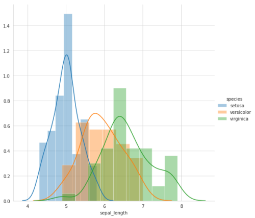
It is representation of probability distribution of data point. Better way to visualize one feature (1-D) is histogram. Lets take an example of sepal_length, shown in Fig. 3. The x-axis is sepal_length where y-axis is number of counts of sepal_length. Light blue, orange and green are the histograms of sepal_length of setosa, versicolor and virginica flower types, respectively (see fig. 4). Histogram tells us how many data points are there in the window of 4 to 6. It shows maximum setosa flowers (around 15) are exist when sepal_length size is 5. Height of histogram shows how often we find particular flower type given sepal_length. Smooth line is called PDF and it is smoothed form of histogram.

5. Box-plot:
It is another technique of visualizing the 1-D scatter plot. Box plot uses median, percentiles and quantiles and put it into plot. By looking at Fig. 4, we do not know what is 25th, 50th or 75th percentile of setosa sepal_length. To know that, we use box-plot, it uses percentiles. In the Fig. 5, x-axis is flower types or 3 boxes corresponding to each class label and y-axis is septal_length. Lets understand green color box, it tells what 25th, 50th and 75th percentile value of sepal length for virginica. Whiskers are generally minimum and maximum value of feature for each class however, there is no standard way to draw it. Besides, box-plot helps us in writing a rules and finding mis-classifications or errors.

That’s all for this post! 

You can also check a post on confusion matrix and classification metrics: https://ai-researchstudies.com/confusion-matrix-and-classification-metrics/
Kindly follow my blog and stay tuned for more advanced posts on AI!
Thank you!


[…] You can also visits other posts on machine learning techniques here. There is a post on a data analysis, please check it out here. […]